python Python for Data Science
By Steve on August 5, 2019
Data Visualizations in Python and Jupyter Notebook Link to NB Viewer
# Basic Strings in Python

variable1= "This is a sample string"
print (variable1)
This is a sample string
# Lists in Python

variable2 = ["ID", "Name", "Depth", "Latitude", "Longitude"]
depth = [0, 120, 140, 0, 150, 80, 0, 10]
variable2[3]
'Latitude'
# Simple computation to pull the mean value from the elements of the Depth list

sum(depth)/len(depth)
62.5
# Tuples in Python (Cant modify the content after creation)

depth = (0, 120, 140, 0, 150, 80, 0, 10)

print(depth)
(0, 120, 140, 0, 150, 80, 0, 10)
# Dictionaries in Python

variable4 = {"ID":1, "Name": "Valley City", "Depth":0, "Latitude":49.6, "Longitude":-98.01}
variable4["Longitude"]
-98.01
# Loops in Python
variable2 = ["ID", "Name", "Depth", "Latitude", "Longitude"]
print(variable2[3])
print(variable2[4])
Latitude
Longitude
for element in variable2:print(element)
ID
Name
Depth
Latitude
Longitude
# Functions & Classes
# 'Print' is a built-in function...

print("Hello")
Hello
# Time Series Data - Snow-depth data for different locations inside three seperate Python lists - one list per month.

december_depth=[0,120,140,0,150,80,0,10]
january_depth=[20,180,140,0,170,170,30,30]
february_depth=[0,100,100,40,100,160,40,40]
# Defining 'average' function
# 'any_list' is just a variable that's later assigned the given value when the function is executed

def average (any_list):return(sum(any_list)/len(any_list))
average(february_depth)
72.5
# Importing the NumPy library (generate multi-dimensional arrays)

import numpy
array_1d=numpy.arange(8)
print(array_1d)
[0 1 2 3 4 5 6 7]
array_2d=numpy.arange(8) .reshape(2,4)
print(array_2d)
[[0 1 2 3]
 [4 5 6 7]]
# Putting lists into NumPy array

depth=numpy.array([december_depth, january_depth, february_depth])
print(depth)
[[  0 120 140   0 150  80   0  10]
 [ 20 180 140   0 170 170  30  30]
 [  0 100 100  40 100 160  40  40]]
# NumPy Mean Function

numpy.mean(depth[:,0])
6.666666666666667
# Exploring SciPy Library
import scipy

# help(scipy) returns: "IOPUB data rate exceeded error"
IOPub data rate exceeded.
The notebook server will temporarily stop sending output
to the client in order to avoid crashing it.
To change this limit, set the config variable
`--NotebookApp.iopub_data_rate_limit`.
print(depth)
[[  0 120 140   0 150  80   0  10]
 [ 20 180 140   0 170 170  30  30]
 [  0 100 100  40 100 160  40  40]]
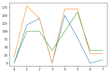
# MatPlotLib, For Loop, PyPlot

import matplotlib.pyplot as plt
for month in depth:
    plt.plot(month)
plt.show()
# loading the modules
import pandas as pd
import numpy as np
import matplotlib.pyplot as plt
from scipy import stats

# this will show the charts below each cell instead of in a seperate viewer
%matplotlib inline

# Loading a .CSV
grades = pd.read_csv('class_grades.csv')

# Prints Grades
grades
| Name | HW1 | HW2 | Midterm | Participation | Exam | |
|---|---|---|---|---|---|---|
| 0 | Bhirasri, Silpa | 58 | 70 | 66 | 90 | 95 |
| 1 | Brookes, John | 63 | 65 | 74 | 75 | 99 |
| 2 | Carleton, William | 57 | 0 | 62 | 90 | 91 |
| 3 | Carli, Guido | 90 | 73 | 59 | 85 | 94 |
| 4 | Cornell, William | 73 | 56 | 77 | 95 | 46 |
#Calculating a Weighted Average in Python
grades['grade'] = np.round((0.1 * grades.HW1 + 0.1 * grades.HW2 + 0.25 * grades.Midterm + 0.1 * grades.Participation + 0.45 * grades.Exam), 0)
grades.head()
| Name | HW1 | HW2 | Midterm | Participation | Exam | grade | |
|---|---|---|---|---|---|---|---|
| 0 | Bhirasri, Silpa | 58 | 70 | 66 | 90 | 95 | 81.0 |
| 1 | Brookes, John | 63 | 65 | 74 | 75 | 99 | 83.0 |
| 2 | Carleton, William | 57 | 0 | 62 | 90 | 91 | 71.0 |
| 3 | Carli, Guido | 90 | 73 | 59 | 85 | 94 | 82.0 |
| 4 | Cornell, William | 73 | 56 | 77 | 95 | 46 | 62.0 |
# Using a letter_grade Function and if Command in Python

def calc_letter(row):
    if row.grade>=90:
        letter_grade = 'A'
    elif row['grade'] > 75:
        letter_grade = 'B'
    elif row['grade'] > 60:
        letter_grade = 'C'
    else:
        letter_grade = 'F'
    return letter_grade
# In Python there are no "then" statements, no braces, and few brackets or parentheses. Flow is determined by colons and indents.

grades['ltr'] = grades.apply(calc_letter, axis=1)
# "apply" with axis=1 applies a function to an entire column using values from the same row.

grades
| Name | HW1 | HW2 | Midterm | Participation | Exam | grade | ltr | |
|---|---|---|---|---|---|---|---|---|
| 0 | Bhirasri, Silpa | 58 | 70 | 66 | 90 | 95 | 81.0 | B |
| 1 | Brookes, John | 63 | 65 | 74 | 75 | 99 | 83.0 | B |
| 2 | Carleton, William | 57 | 0 | 62 | 90 | 91 | 71.0 | C |
| 3 | Carli, Guido | 90 | 73 | 59 | 85 | 94 | 82.0 | B |
| 4 | Cornell, William | 73 | 56 | 77 | 95 | 46 | 62.0 | C |
# Example Code for Creating a Trendline in Python
student = 'Bhirasri, Silpa'

y_values = [] # Create and empyt list
for column in ['HW1', 'HW2', 'Midterm', 'Participation', 'Exam']:
    y_values.append(grades[grades.Name == student][column].iloc[0])
#Append each grade in the order it appears in the dataframe
y_values

x = np.array([1,2,3,4,5])
y = np.array(y_values)
slope, intercept, r, p, slope_std_err = stats.linregress(x,y)
# This automatically calculates the slope, intercept, Pearson correlation, coefficient (r), and two other statistics I wont use here.

bestfit_y = intercept + slope * x
# This calculates the best-fit line to show on the chart.

plt.plot(x, y, 'ko')
# This plots x and y values; 'k' is the standard printer's abbreviation for the color 'blacK', and '0' signifies markers to be circular.

plt.plot(x, bestfit_y, 'r-')
# This plots the best-fit regression line as a 'r'ed line (-).

plt.ylim(0, 100)
# This sets the upper and lower limits of the y axis.
# If it were not specified, the min and max value would be used.

# Change the Style to default parameters
plt.rcParams.update(plt.rcParamsDefault)

# Change the chart style to xkcd
# plt.xkcd()

plt.show() # since the plot is ready, it will be shown below the cell

'Pearson coefficient (R) = ' + str(r)
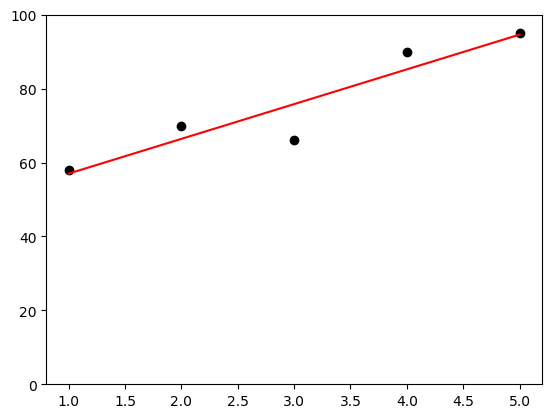
'Pearson coefficient (R) = 0.932202116916'